An 'appy online experience
With so much flight research and booking done online these days, which airline app does it best?
Over the last 9 months I’ve flown on about a dozen different international airlines. That’s not to boast; merely to state a fact. Before this most recent flurry of flights, the last time I embarked on an extended trip requiring plenty of airport visits was just prior to Covid, when I spent 3 months on the move between Mexico City and Santiago, Chile.
Anyway, this latest list of carriers includes Cathay Pacific, Korean Air, and China Airlines, as well as Iberia, TAP, Ryanair, British Airways, Air Baltic, and probably a few others in between. And none come remotely close to Lufthansa in the digital customer experience, content design, and notifications of its app or web platforms.
As a content designer, UX writer and all round digital word nerd of more than 2 decades, the national carrier of Germany has the most simple, intuitive, helpful, timely and instructive content I’ve even encountered in what can be an emotionally challenging context: that is, in booking, checking in, boarding and flying to, or within, a foreign country.
And I know a bit about this specific user experience, having worked on the new Qantas website and app for several years. Of course, there are scores of other airlines that might do something similar. If so, kudos to them. But they’d need to reach a very high bar to match the UX of Lufthansa.
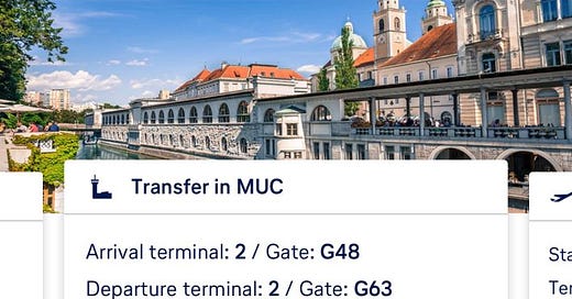
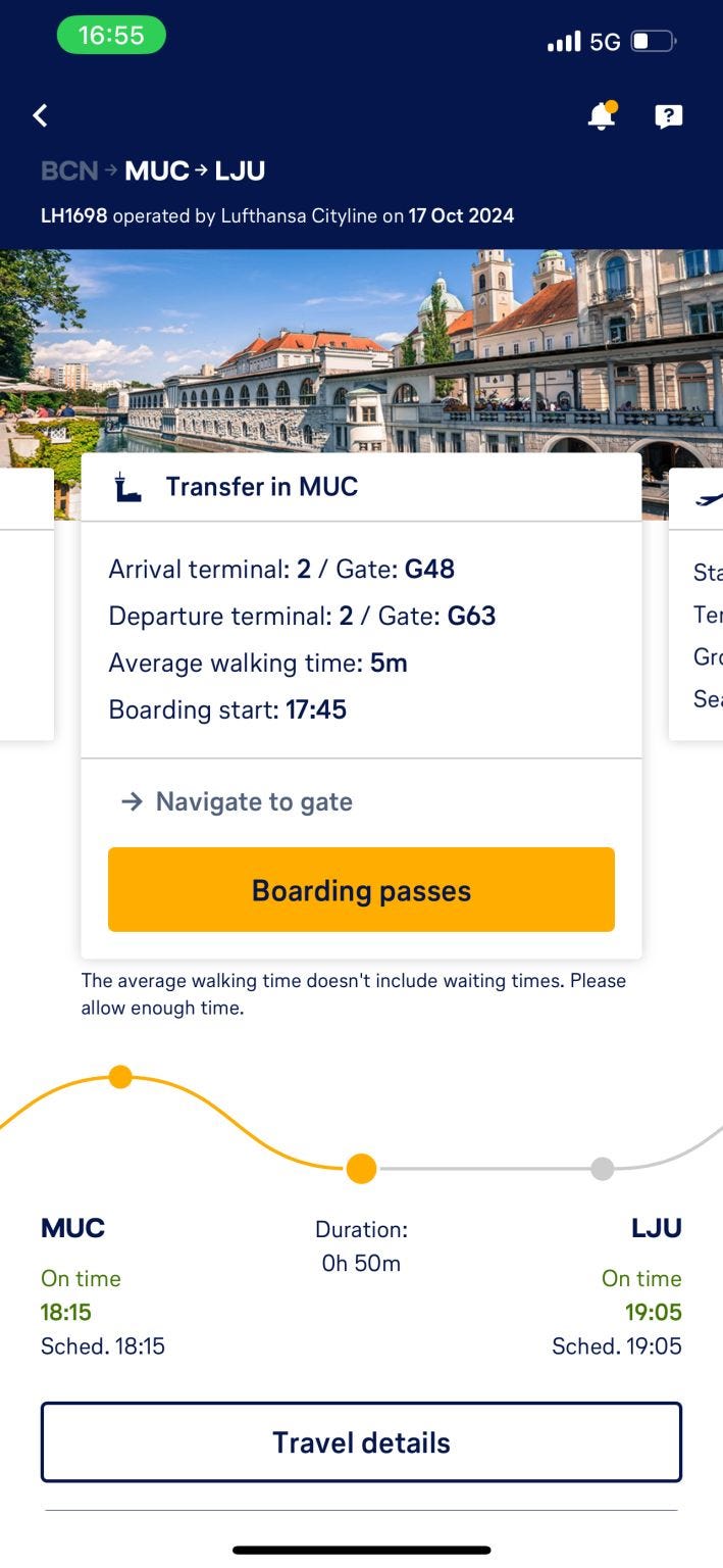
See the pic above. This just one example of many. In late October 2024, I had a Barcelona to Ljubljana flight with a Munich stopover. The first leg was delayed, and with a tight connection in Munich, tension was rising. But the app kept me informed and up to date every step of the way.
Here, the departure gate in Munich for my Slovenian leg changed because of the delay, and the app updated in real time before I’d left Barcelona. That wavy line is the literal customer journey, complete with real-time status updates (on touchdown in Munich).
And the ‘Navigate to gate’ link expands to show me the schematic path I need to take between landing and departure gates, with indicative walking time. Other passengers, including the woman beside me, had much tighter connections, and knew exactly where/how they had to go, before unbuckling their seatbelts on touchdown.
Screens either side of this shown (which you swipe between) give details for every stage of the journey. The whole, ongoing customer experience makes this content designer’s heart skip a beat, in that you can see the immense research and testing that must have gone into the service design.
And the German to English translation is pitch perfect, suggesting Lufthansa’s ‘localisation’ team know their stuff too.
If ever the choice of airline arises in the future, and the German national carrier is an option, I know who I’ll be flying with. Danke Lufthansa.


